Disclaimer: The contents of this presentation do not violate any non-disclosure agreement with the organization for which the product was created. This product has been commercially released (2015-2016).
Samsung’s My Galaxy
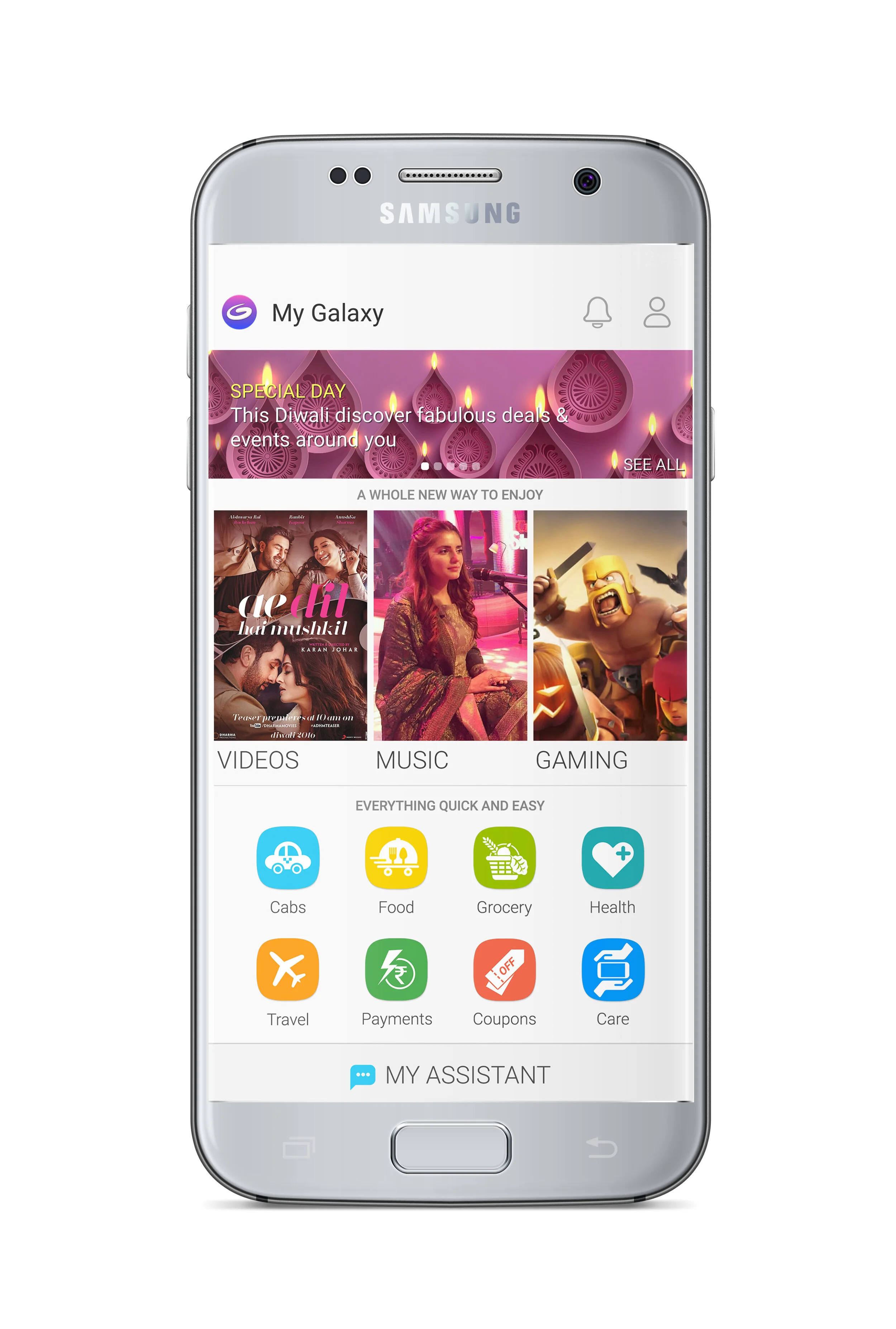
My Galaxy is a unique native application within the Samsung ecosystem (Android and Tizen), designed to create value for Samsung users in India. A one-stop-shop for exclusive deals, discounts and premium offers, the app integrates a whole gamut of value-added services. The subsequent version release introduced Entertainment: Video, Music and Games along with all the pre-existing features.
Timeline: 2015-2016
Problem Statement
The Indian e-commerce market is full of applications for ordering food, movie tickets, cab service, grocery shopping, medicines, travel bookings and more. A majority of Indian phone users, between 2014-2017, especially from tier 2 and tier 3 cities were using phone with limited storage space.
My Galaxy 2.0 aimed to be an aggregator for all utilitarian needs. Thereafter, with the 3.0 version upgrade it introduced entertainment options such as video, music and games. Along with these features it also contained all the device related services in the same app such as Samsung Care and Samsung Upgrade. In the process it aimed to eliminate the need to download and store different apps that filled up the phone’s storage space. This was done by introducing APK integrations with these third-party apps.
Team
A team of interaction designers and visual designers worked in close collaboration with a project manager, key stakeholders in the fields of marketing and sales, content management, data science and development, partner integration teams and quality assurance.
My Role
My role included leading the visual design directions along with significant contributions to user research, interaction designs, prototyping and testing by pairing with the other interaction designers. It encompassed:
User Research
Interaction Design
Visual Design
Prototyping & Testing
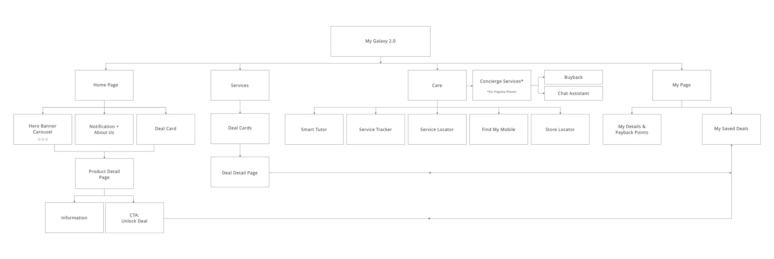
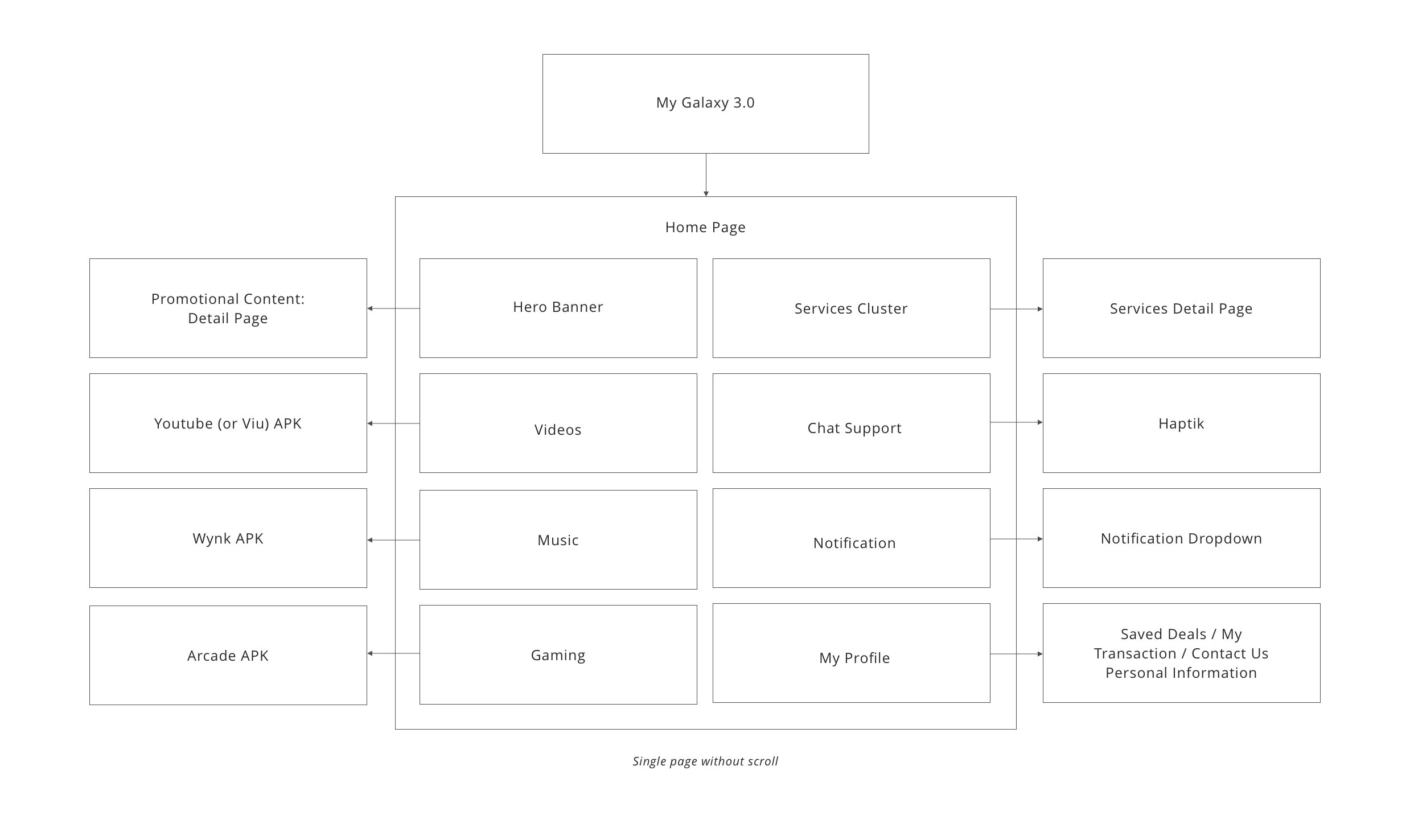
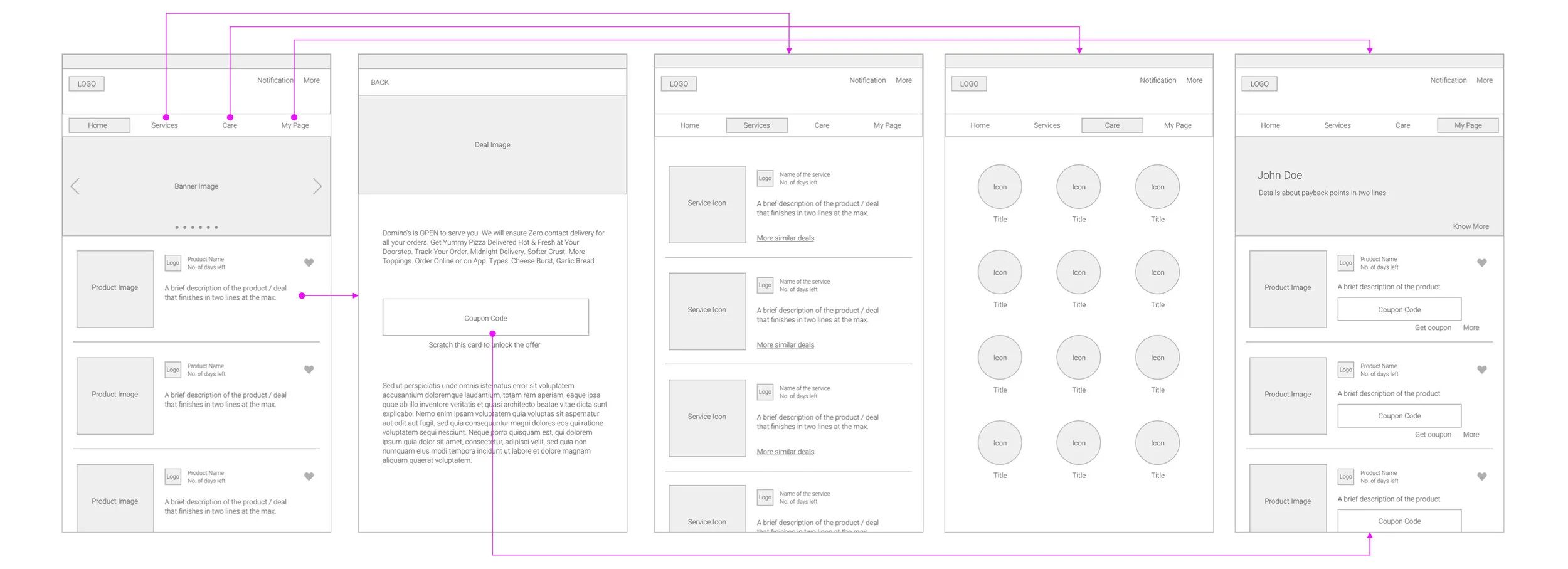
Information Maps
Diagram 1: My Galaxy 2.0 / Diagram 2: My Galaxy 3.0
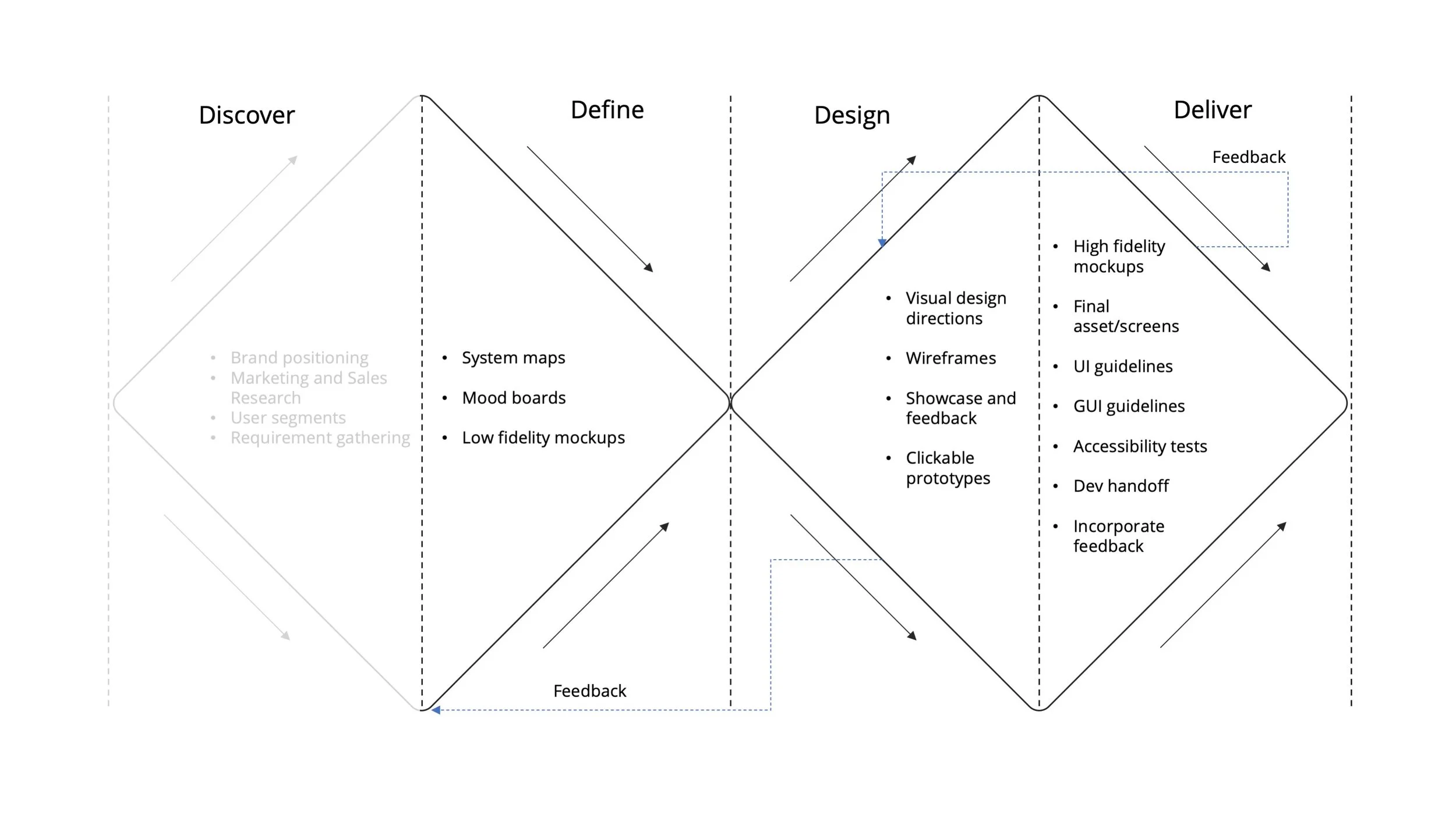
Process
A modified double-diamond approach was followed starting with defining the problem and finding solutions, as discovery was done previously.
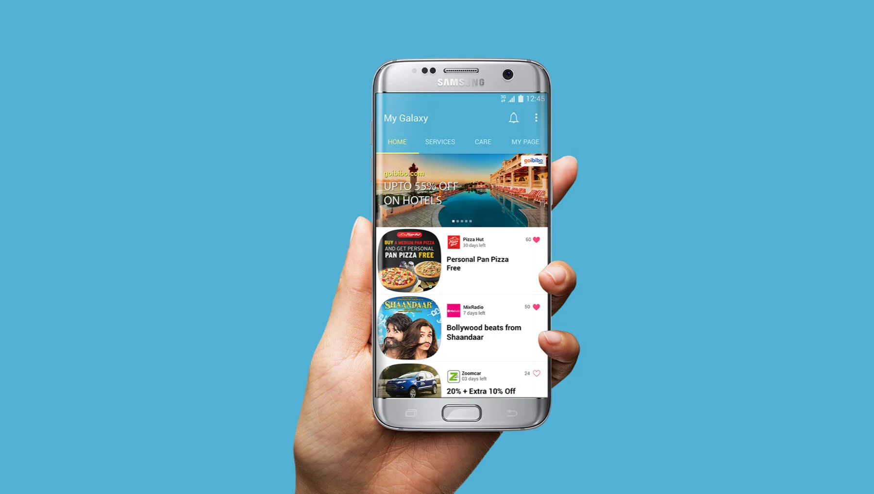
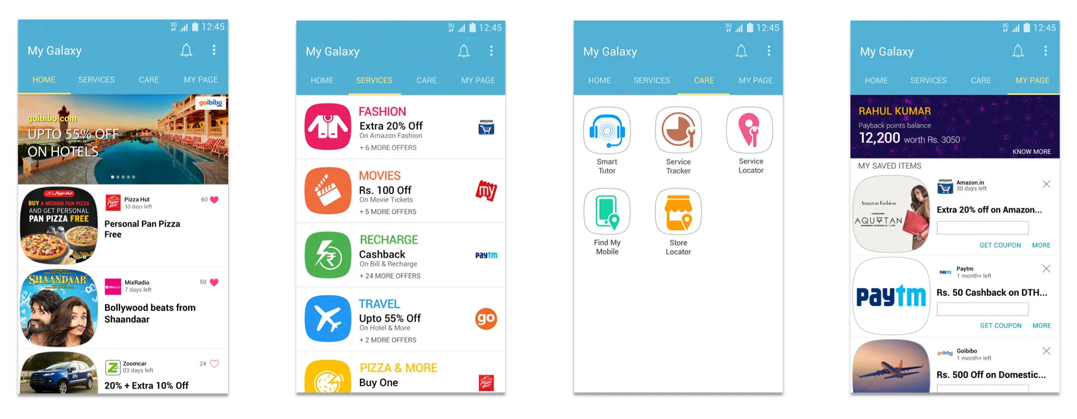
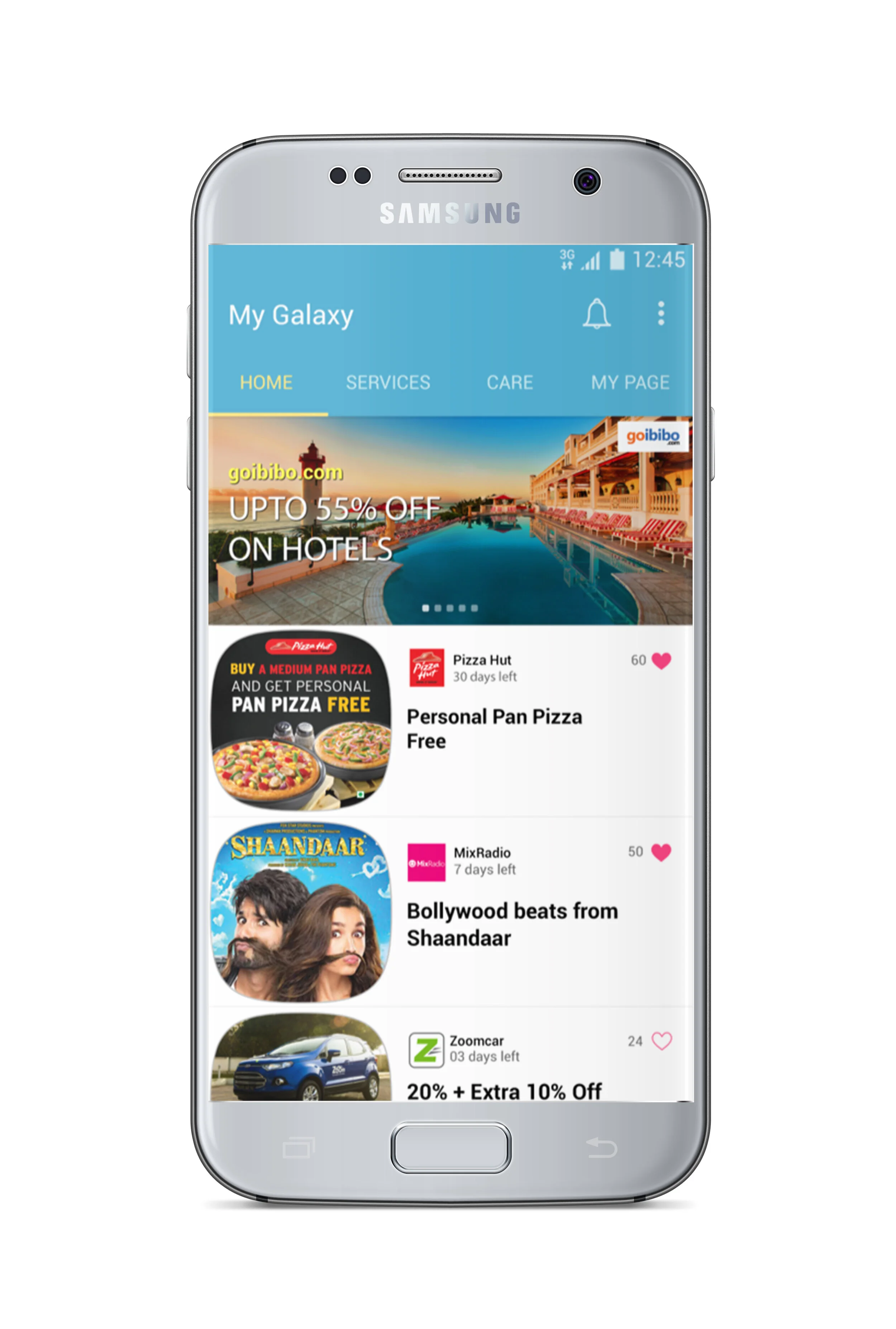
My Galaxy 2.0 - Key Screens
Key Achievements
Understanding the user segment
An ever-expanding economy such as India is largely driven by its millennials. These are people who are aged between 16-30 years constituting 34% of the Indian population. Moreover, they are the 75% of the internet users of India. Hence, the millennials emerged as the most powerful target group. Constantly seeking better value in everyday expenses, investments and experiences, they are the pioneers of the new Indian market-space.
Through empathy maps, persona creation and focus group interviews, we listed down some of the dominant characteristics and traits of our target group and came up with keywords that define them:
Aspirational
Traditional yet trendy
Multifaceted
Challenging limits
Unapologetic
Reward oriented
Moment driven
Leading the visual design team
After the first draft and the initial success with downloads, the team felt the need to refresh and revamp the look of the app to meet the latest trends and expectations. These changes were taken into consideration to meet the latest Samsung's visual identity, that included various elements like shapes, colors and typography.
Checking usability
The colour saturation, contrast, size of icons and typography were designed for the low and medium range devices. Usability checks was an integral part of the process to optimize display and usability for these phones.
Creating a UI library kit
This has helped maintain consistency in the overall look and feel across different pages on the app.
Creating UI and GUI Guides
A UI (User Interaction) guide contained thorough documentation of iterations, interaction design details, user flows and system maps for development teams to refer to during implementation. A GUI (Graphic User Interface) guide contained visual breakdown of screen element, pixel calculations, asset folders for all graphic assets such as icons, buttons, colour values and formulas for scaling.
Balancing the ‘More is More’ approach
My Galaxy was given a brand identity of its own. There was so much packed into one app that as designers, we had to ensure the effectiveness of information hierarchy and minimal cognitive load. At the same time, we introduced delightful interactions and animations.
For premium services on flagship devices, we introduced a rich look and feel. All these came together to make the user experience more seamless, enriched and meaningful.

Designing ‘Concierge’
The Concierge platform essentially offers a personal assistant who can offer a bunch of services to Galaxy S7 and Galaxy S7 edge buyers. This personal assistant is a helpdesk wherein you can call between 10AM and 6PM and request different services like setting reminders, sending gifts to someone order groceries or getting a web check-in done before your flight.
The concierge services required a set of icons and visual language that highlight the premium nature of its services. Keeping in sync with the latest S7 branding, for which the Concierge Services are designed, the visual direction included using thin gold lines on a rich and classy blue background.
Adapting to change
My Galaxy’s 3.0 version saw a significant change in brand positioning and priority. In addition to its ‘value-based’ services, the app introduced ‘Entertainment’ as its unique offering. This meant going back to drawing board to incorporate a seamless, clutter-free experience that puts the focus on videos, music and games.
Left: My Galaxy 2.0, Right: My Galaxy 3.0
Result and take-aways
Since its launch in 2015 and till 2017, the app had more than three million downloads. It is one of Samsung’s leading applications in India that serves its customers through their smartphones, currently being used by 100,000,000+ users. The application is available on the Android and was previously also hosted on the Tizen platform.
In a pre-agile ecosystem, the design team’s role was crucial in assimilating inputs from various teams, such as marketing and sales, content management, data science and development, partner integration teams and quality assurance. I learnt immensely from this collaboration with cross-functional teams and created a common roadmap by converging on different perspectives.
We tried validating design decisions with limited set of users and iterated continuously with shorter, more frequent releases, instead of a ‘big-bang launch or version update’. We staggered the new integrations (such as Samsung Upgrade, Concierge Services) to incorporate user feedback and reviews that gave us enough room to constantly build, test and deploy with user data.
Promotional Video
Here is a video created to promote the ‘visual refresh’ of My Galaxy 2.0 within the design team.
Password: thebluebulb